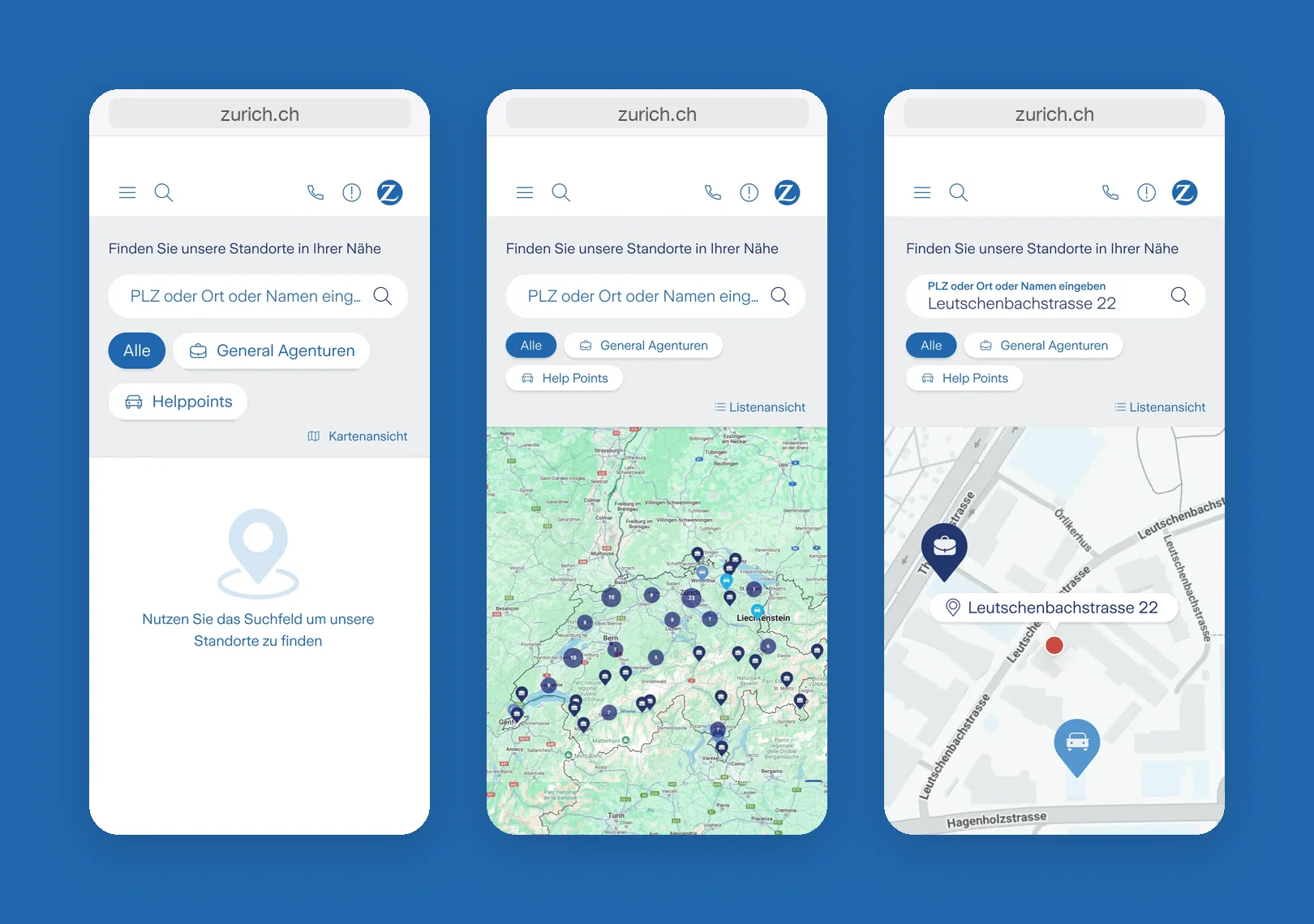
Analytics, user feedback and usability tests showed where people got stuck when looking for the nearest agency. Many used the location search again and again without finding what they were looking for:
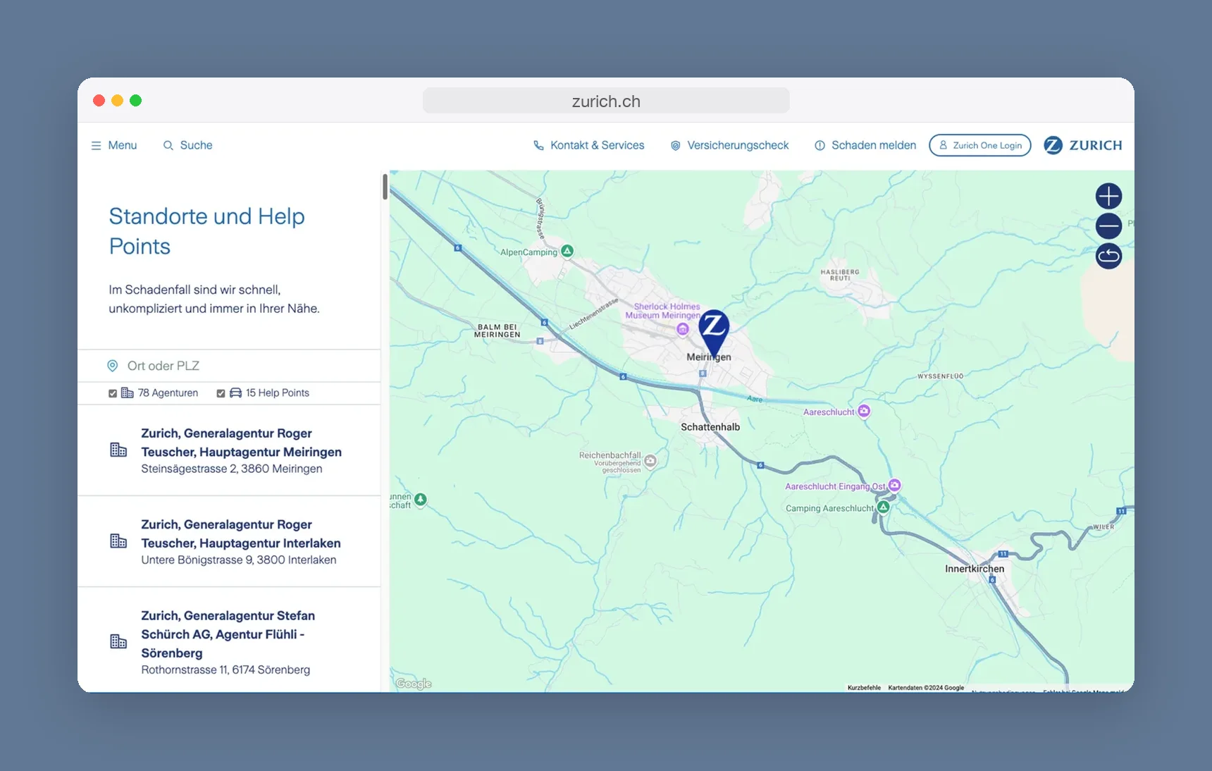
The sidebar took up much of the screen, leaving little room for the map.
People had to scroll through a long list of agencies with their full legal names to find the one near them.
Many did not recognise the search field as one.
The small filter checkboxes made it unclear what was being shown.
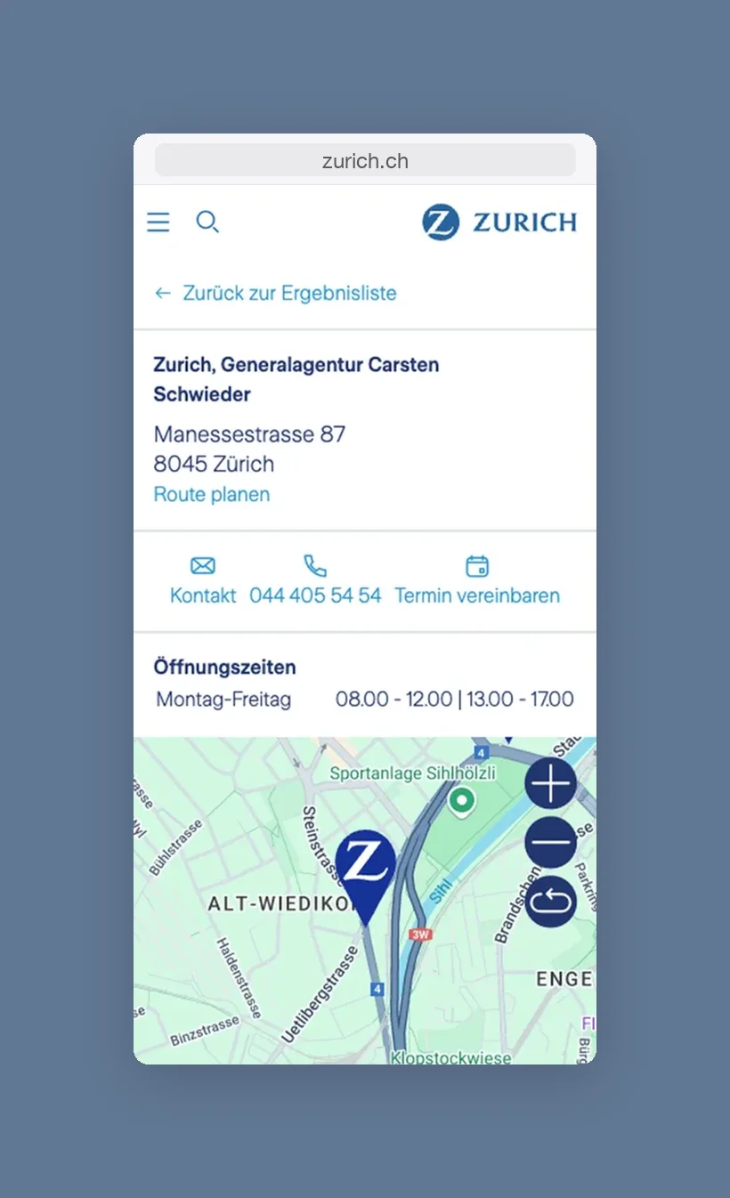
On mobile, the map in its small frame was hard to use, and people could not see where they were.
The reset icon on the map was not understood.
On the detail pages, the information people were looking for got lost.
After
Solution
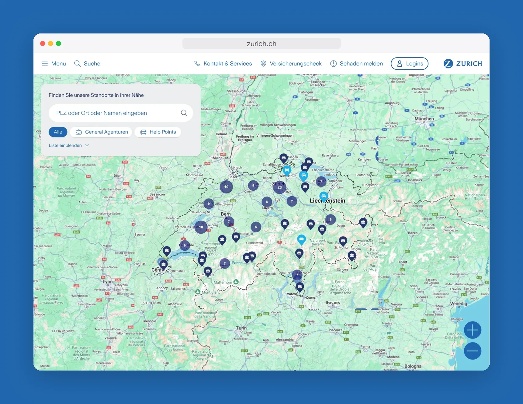
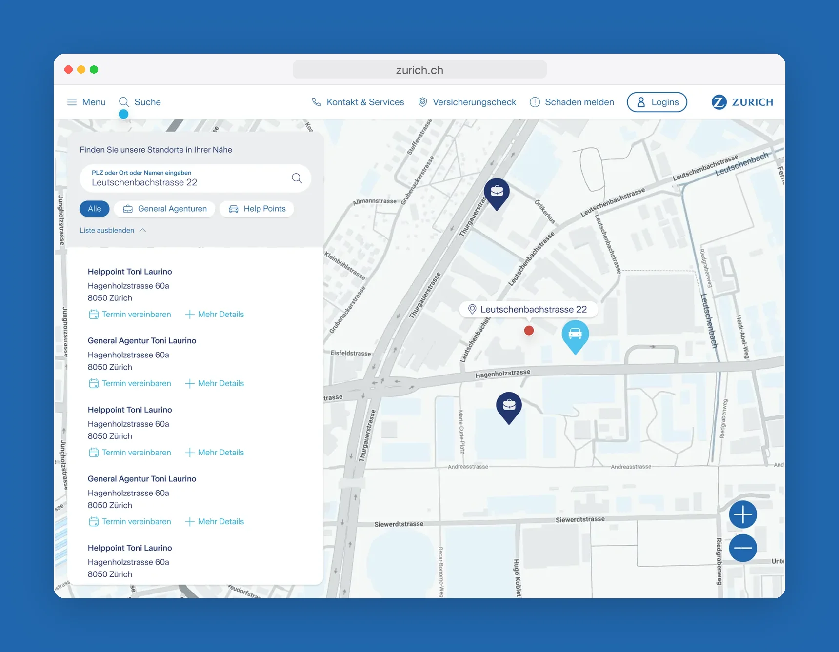
One clearly visible search field.
Larger filter buttons that clearly show which one is active (all, general agencies, help points).
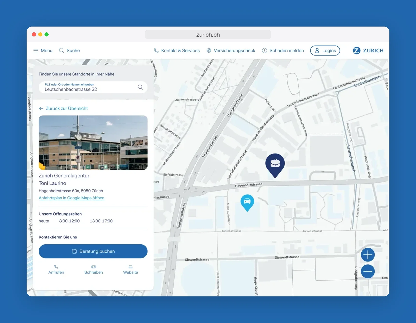
A slimmer results list next to the map.
On mobile, switching between the list and a full-size map that shows your own location.
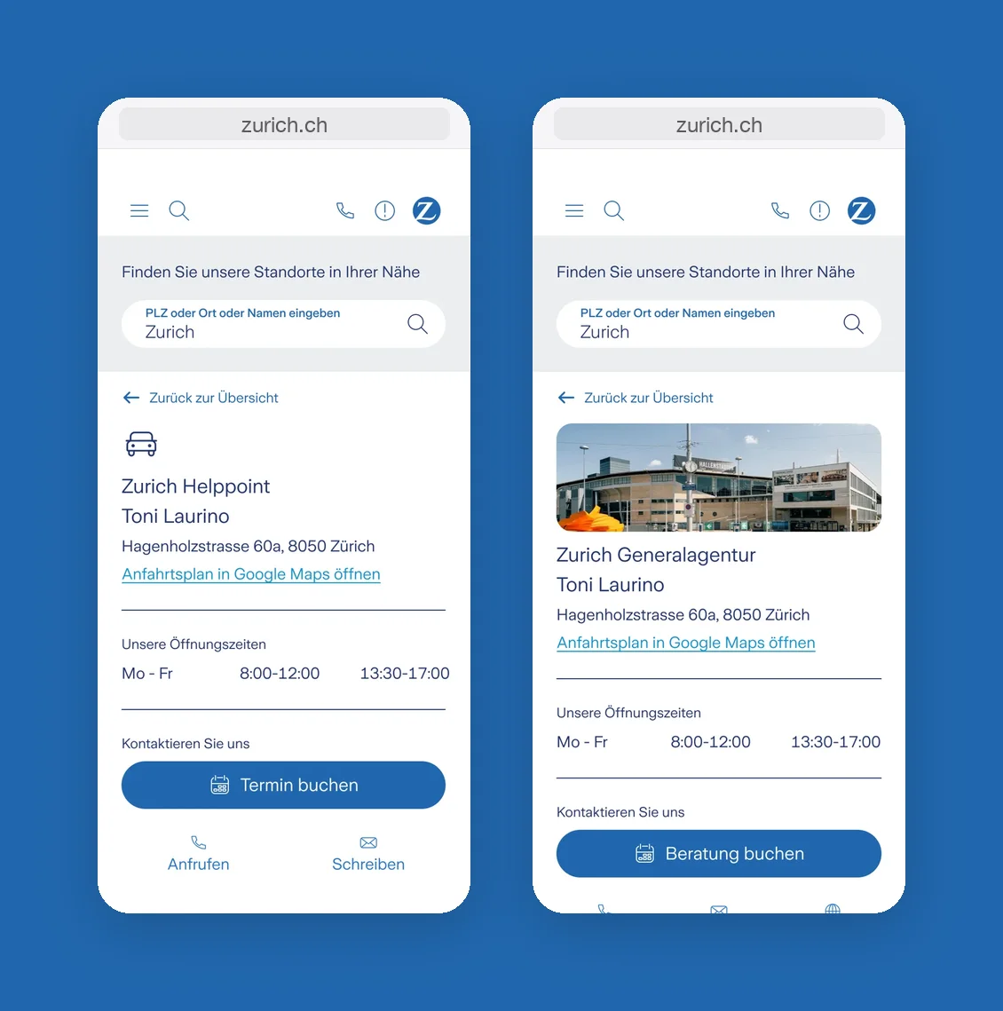
A structured detail page for each location with opening hours, directions and a clear call to action to book an appointment.
Photos of each location, so you recognise the place when you get there.
After the launch, analytics showed that people searched around much less, found their location faster and dropped off to other pages less often.